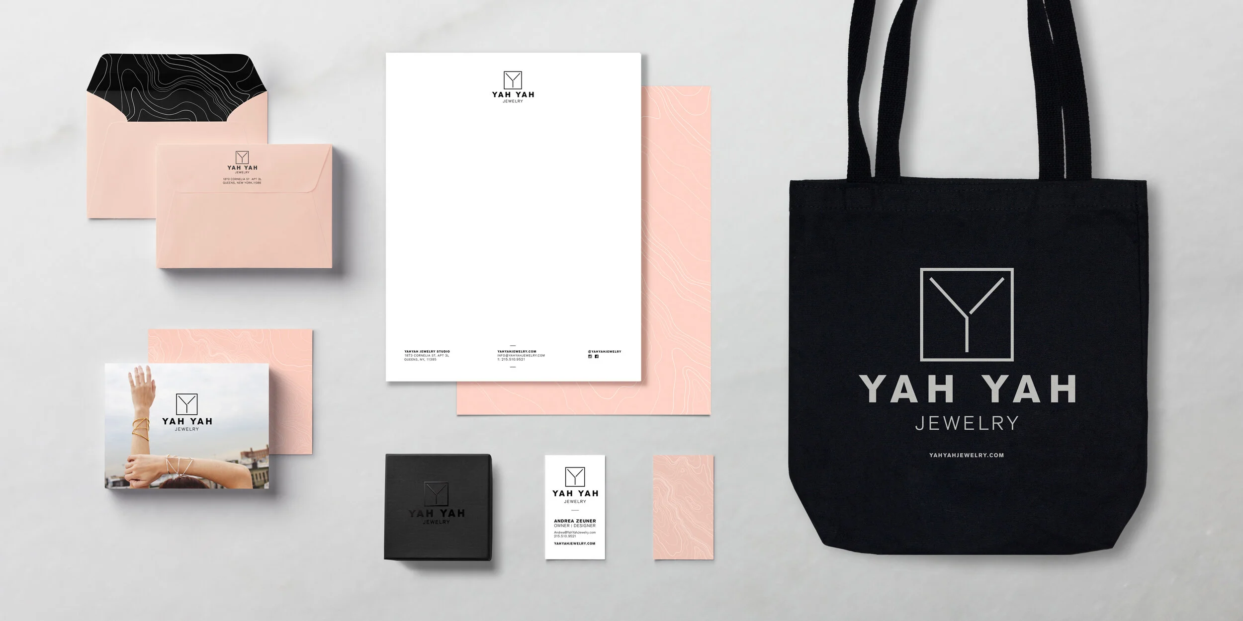
Yah Yah Jewelry
PROJECT ROLES: BRANDING, ART DIRECTION, DESIGN, PHOTOGRAPHER
The scope of the project was to create a Logo, identity, and branding for minimal jewelry line Yah Yah Jewelry. Yah Yah draws inspiration from landscapes on both a micro and macro scale. These inspirations were incorporated into the branding by repurposing topographic maps into a subtle pattern that is used throughout Yah Yah’s collateral and branding.
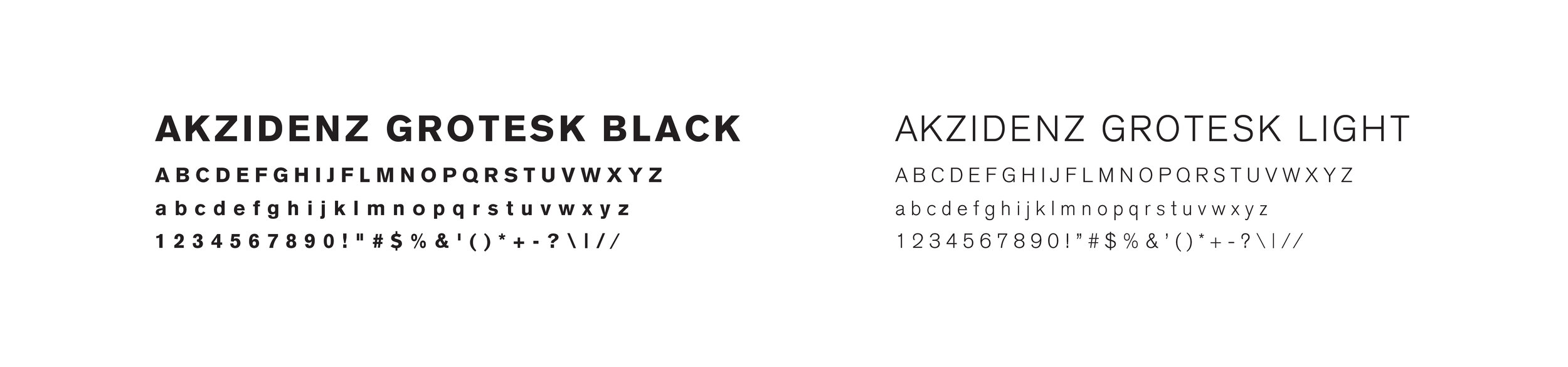
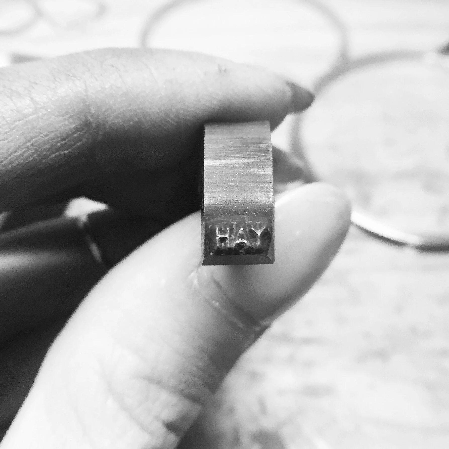
Using Yah Yah’s geometric and minimal designs as inspiration, a custom Y based off of the typeface Akzidenz Grotesk Black was created. The Y is incorporated into the logo and stamped onto the jewelry itself. Akzidenz Grotesk was utilized throughout Yah Yah’s branding because of its simplistic and realist qualities. The colors selected for Yah Yah are simple, neutral colors that compliment the metals and stones used on the pieces.


LOGO
PATTERN

COLORS

TYPEFACES